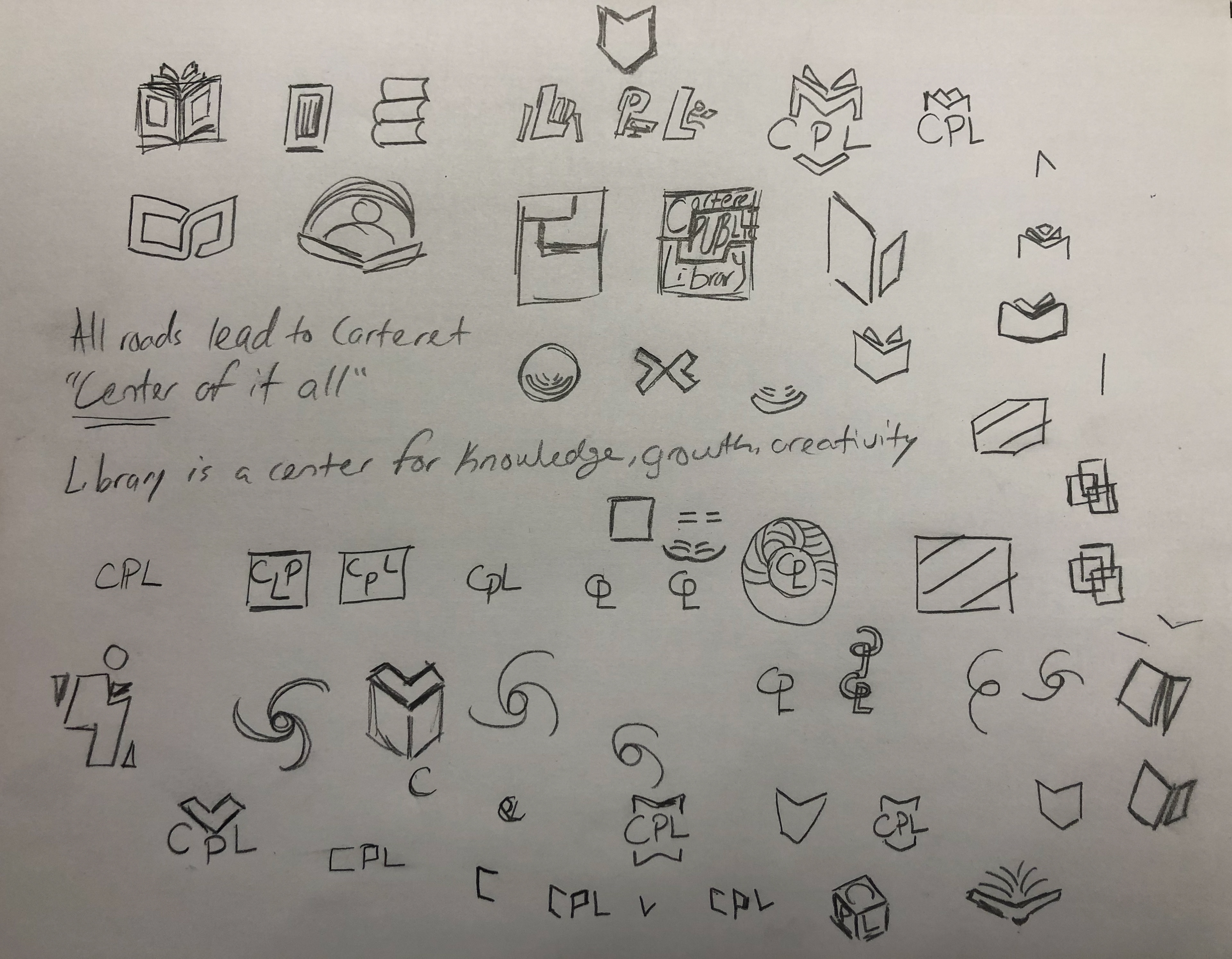
Here you can see I wanted to embody the Borough of Carteret's slogan "Center of it All" by creating a logo that would demonstrate that the library is also a part of that center. The shapes I designed towards were circular and square to both represent the structural integrity the library has on the community in terms of accessibility, but also how involved the library is in the community.

Here the shapes and illustrations were becoming more refined until I settled on a design that showcased an open book shining through its center.
The new library logo included a brighter hue of blue, bold and sans serif text, and the symbol of a book and sun together signifying a beacon of knowledge, a library where people go to build themselves up - life or career wise- using the free resources provided to them.
The old logo of the library consisted of many points of information from its thin serif text, to the contact information below it, to the complex graphic above the library name which could only be visible and understood at large scales.
This is a 3D mock of what the new building signage for the library would look like, with emphasis on the new logo symbol.
Above contains the various font styles of the same font Neue Haas Grotesk used alongside the library rebranding campaign. The last style, 95 Black, is the style used for the new logo. The others were suggested for official use for fine print, headers on official documents, and more.


